Showing posts with label Painting Methods. Show all posts

Wednesday, November 6, 2013

Creating a Silver Coin for the Royal Canadian Mint

It has been a year since I was commissioned by the Royal Canadian Mint to design and produce a painting for a 20 dollar silver coin.  Now that the official release has finally arrived, I can take the wraps off of the art and tell the story behind the project and the painting that I created!

It all began in October, 2013 when a product manager at the Mint came across one of my hockey paintings on rdewolfe.com and decided that this was something they would like to see on a Canadian collector coin.  I was then contacted and commissioned to come up with a new design featuring Canadian children playing the much loved game of pond hockey.

The production work for a new coin is long and arduous, so it was imperative that I immediately begin working out the design for the new coin.  Country, kids and hockey are favourite subjects of mine, so I eagerly began working on the project.  Sketches were soon approved and painting commenced!

Original sketch for Pond Hockey painting

The first sketch was received with enthusiasm but because it was decided to reproduce the background buildings in bas-relief rather than full colour, it was necessary to separate the figures in the foreground from the objects in the distance.  I submitted a new drawing that was then deemed perfect for the job!

Final sketch for Pond Hockey painting

Once I received final approval for the drawing, I transferred it to canvas to begin the painting.  The next step was to apply a thin blue wash overall to create a 'cool' atmosphere.


Now I begin painting in dark areas using acrylic paint for speedy drying.  This allows me to move forward quickly.


When I begin adding local colour throughout the painting, things start to come together.  At this point I have switched to alkyd oil paint.


Now I add in colour and texture on the ice surface and the background scene.  All the basics are there, so now it is a matter of finishing up by adding more colour and detail to the painting.  Originally, I intended to do a circular painting as indicated by the initial painting of the sky.  In the end, however, I decided it would be more attractive to extend the scene into a square format, resulting in a more complete, square painting.

Finished painting "Pond Hockey" 

And here it is....the finished one ounce silver coin, available for purchase at themint.ca or one of the dealers listed on their web site, including Canada Post Corporation.  One of the really neat features of this limited edition silver coin is the full colour treatment, making it a very unique collectible!


Wednesday, August 14, 2013

Iris Garden

This is another painting that I did recently as a demonstration during an acrylic painting class.  The iris is one of my favourite flowers and my wife and I grow them in our perennial gardens on our farm.  I love the combination of blues, purples and yellows that are so common in these tall, majestic flowers.  It is a pity that they bloom for such a short time.

'Iris Garden' by Richard De Wolfe
12 X 9 acrylic on panel


We work quickly in these painting classes as I explain the method while I demonstrate the techniques. At the same time, I try to assist my students with their work, with the goal of helping them successfully complete their painting by the end of each two hour class.


The first step is to loosely place the main objects on the canvas with light pencil lines, just indicating the general shapes.  This way, you have not invested much time in the drawing before you are sure that the placement is what you want.


When you are happy with the placement of the general flower shapes, it is time to refine them, adding basic detail to the petals.  Do not 'over draw' the flowers.  There is no need to labour over excessive detail that would be obliterated when you begin to paint.  Don't get too rigid with outlines either. This way you will not become a slave to lines you have drawn on the canvas.  These are guidelines only!


Now we mix up the basic flower colours and paint the general flower shapes with a large brush.  Some effort is made to preserve most of the construction lines that separate different areas within the flower petals.


Now we add a general background colour using a broad brush and lots of expression in the brush strokes.  Avoid making the background flat and boring.  Give your brush work life and energy.  I use a deep blue and green mixture to emphasize the bright flowers in the foreground.


The next step is to add leaves and stems, again using a large flat or filbert brush.  I mix a warmer, lighter green and apply it in simple, direct strokes.  My goal is to create an interesting and balanced design to support the colourful flowers that are the focal point in the painting.


Now we add darker and lighter variations of the stem and leaf colour, creating a pattern of light and shadows that is consistent throughout the painting.  This allows us to also create an illusion of depth, with leaves and stems overlapping each other and dropped shadows under the flower petals to bring them into the foreground.


We turn our attention to the flowers themselves and add light areas to the basic petal shapes to give them form and detail.  This is done carefully, keeping the light source consistent with our previous work.


In the final minutes of the class, we add deep, rich variations of colour to the flowers.  White highlights are applied sparingly to catch the viewer's eye and hold their attention in a tasteful and not too obious a manner.  Any last minute corrections or additions are made and the signature goes on.  Voila!  Fini!

Thursday, April 18, 2013

Winterlude Part 3

"Winterlude" almost there!

I keep adding colour and detail throughout the entire scene.  I want to maintain a balance so that I can judge each new brush stroke against the overall look of the painting.  If you concentrate too much on one area you may find that it doesn't work so well after the rest of the painting is completed.  You also run the risk of 'falling in love' with how that particular area of your work looks and you may not want to make necessary changes as you go forward.  By working more or less equally across the painting, you can maintain a healthier and more impartial perspective on your work.

Here I have painted in the distant trees using a mixture of sap green, ultramarine blue and titanium white.  Ultramarine blue dominates to create an illustion of distance.  Now the local colour of the barn is introduced.  I decided on a soft yellow to promote the feeling of bright sunlight on a cold winter day. I add snow to the branches of the spruce tree in front of the barn and generally add more detail to everything.  I introduce a slight hint of warmth in the sky on the right side of the painting, again to establish a feeling of bright sunlight coming from that direction.  Now I embellish the soft shadows in the snow and on the snowy branches in the foreground using a mixture of ultramarine blue and titanium white.

"Winterlude" 9 X 12 inches acrylic on board


I work fairly consistently over the entire painting as I go along, so everything comes together quite nicely as I near the finish.  I add small details and highlights as necessary, such as brightening the snow on the barn roof, spruce tree, fence and middle ground to suggest bright light in these areas.  I add bits of snow in the forks of tree branches beside the barn and I strengthen the blue shadow areas.

The last area to concentrate on is the foreground.  Layers of detail and colour are added to the birds to make them appear close to the viewer.  The pine needles are finished off with darker and more detailed brush strokes using a combination of sap green and lamp black,  The tree branches are painted in quickly with burnt sienna and lamp black in the shadows.

In order to increase the contrast between the sunny background and the shadowed foreground, I add a glaze of ultramarine blue and mat medium over most of the pine branches and the birds until I see a clear division between the two areas.  Once the signature is added, the painting is finished!


Automotive Art

'84 Corvette' 11X14 Acrylic on board


I seem to have great difficulty in keeping the old blog up.  The last post was  in late January and now it is mid-April already!  Too many distractions I am afraid.  Many days I plan on writing a post but once the day gets started everything changes and I find myself emmersed in something entirely different.  There just never seems to be enough hours in the day!

I used to do a lot of car art for various auto manufactures.  Ford, GM, Nissan, Toyota, Saab and Jeep, to name a few.  This kind of work can be very time consuming and usually requires a great deal of precision and attention to detail since the finished art is closely inspected by engineers.  The trick is to be true to the design but also instill artistic flair at the same time.  This painting was done with a combination of pen and ink and painted and airbrushed acrylic.  The background was painted on a surface roughened with gesso and a stiff brush before the lettering and symbols were painted by hand.  The car and reflection were partly brush painted and then airbrushed with acrylic to create a glowing shine.

This was before computer art and photoshop, so the art is all one piece, painted simultaneously on one piece of illustration board.  Everything was done by hand in those days!

'32 Packard'  11X14 acrylic on canvas 


This one is a very different approach.  I worked on canvas this time and completed almost the entire picture using a brush and acrylic paints.  The background was applied using a very thin and drippy mixture of mat medium, acrylic paint and water.  The ghost image was painted in with monochromatic detail before additional applications of darker and slightly heavier paint were added to the upper section of the canvas.  The feature car was painted in detail and strong colour before a few whispy highlights were applied using an airbrush.

I was quite pleased with the effective colour and contrast of texture and detail in this painting.  To me, it conveyed a feeling of age of the vintage car but a sense of perfection in the restoration being portrayed at the same time.

Both of these auto paintings were originally commissioned as car magazine covers.  These were wonderful assignments and I enjoyed doing a series of similar paintings for more than a year before the publication ultimately folded.

Friday, January 25, 2013

Winterlude Part Two

"Winterlude" a work in progress

Now I begin blocking in a few colours to create an underpainting on my illustration board.  The sky is roughed in with a combination of cerulean blue and titanium white acrylic pigments.  Because the light is coming from the right side of the painting, I transition from a very pale colour on the right to a darker sky on the left.  I block in the shadows on the barn roof and in the snow.  The snow surfaces that are directly in sunlight are blocked in with titanium white.  I use cerulean blue to add a few contours to the shaded, snow laden boughs in the foreground.

"Winterlude" one step closer!

I keep adding more colour and more detail, gradually establishing my colour scheme and mood of the painting.  I use cadmium red to wash in basic tones on the male and female cardinals and slowly build contours of light and shadow as I go.  The plumage of the female cardinal is primarily drab and somewhat olive, so I use a combination of cadmium yellow, titanium white and ultramarine blue to create this colour.  The spruce tree in the middle ground and the pine boughs in the foreground are quickly blocked in with sap green.  Next, I introduce burnt sienna on the fencing and bare deciduous trees in the middle ground.  I also build a little more shadow contour on the male cardinal with this colour.  Finally, I paint the sky again with more colour and detail in the blending.  My painting is starting to take shape!

Wednesday, January 23, 2013

Winterlude

"Winterlude" sketch

I thought I would do a demo of how I paint this Christmas image for licensing.  I do a fair amount of illustrative art for licensing through Porterfield's Fine Art Licensing.  A winter scene is the perfect choice, since the art that is most in demand for licensing is usually a Christmas theme.  These images are often used for greeting cards, puzzles, gift ware and paper products as well as many other possibilites.  A prospective client will review the work I have available for licensing in a given catagory, choose what suits their project and purchase limited rights to use the image for a specific purpose and for a specific period of time.

The first thing I do when producing this type of art is to brainstorm an idea that will appeal to a maximum number of buyers.  Quite often, as in this case, the idea includes a number of similar images that may evolve into a series of finished pieces, all on the same theme.  Once I feel I have enough inspiration to proceed I come up with reference material for my idea.  I file all types of reference and I take digital photos everywhere I go, so I have a lot of material to draw from.  Now I create sketches to work out my design and create any additional parts of my picture from a combination of memory and imagination.  When this is done  I proceed to do a finished sketch on board or canvas to begin my painting.

"Winterlude"

The next step begins by spraying my drawing with a workable fixative to seal the graphite and prevent smearing.  Now I cover the drawing with matt medium that contains a small amount of acrylic pigment to tone the board.  Usually I will mix one muted colour and cover the entire surface evenly to provide a ground instead of glaring white.  Warm earth tones are my usual choice, but blue-gray is an alternative for a cooler, more subdued look.  

This time I wanted to suggest an extreme contrast between the extreme sunlight on the right and the cool shade on the left of my painting, so I toned the matt medium with cadmium yellow on the right and cerulean blue on the left.  I hope to create the illusion of a winter day warmed by the sun.  These colours will influence the paint that I lay over top as I continue to work.

Monday, December 31, 2012

Think Spring!

I know it is only New Years Eve, but hey!  I'm ready for spring, how about you?  We have been very spoiled here in Southern Ontario for the last few years.......virtually no winter weather to speak of.  Things have started off a bit different this year, however!  Two snow storms in the past week have delivered almost one and a half feet of snow, just in time for Christmas and New Years!  Now you know why spring is already looking rather attractive to me, right?

To help promote the idea (or maybe just the illusion) of an early spring this year, I thought I would post my latest painting (finished yesterday in fact) to warm the cockles of your hearts.........

'Garden Angel'  11"X14" Oil on panel
The Garden Angel is a cement figurine that we have in our bird bath in the back garden.  I have always loved this piece of sculpture and have wanted to paint it for some time.  Prompted by my early longing for the warmth of spring, I decided now was the perfect time to tackle the project.  I used a palette comprised of sap green, ultramarine blue, burnt umber, indian red, cadmium yellow medium, lamp black and titanium white.  I completed the painting in oils after doing a quick underpainting using a deep green acrylic to block in the dark areas first.  I use a combination of regular oils and alkyd oils (especially alkyd titanium white to speed drying), along with Liquin and turps as mediums.  I have a feeling that this new painting will be as close as I get to spring for some time yet.......

 HAPPY NEW YEAR one and all!

Wednesday, February 15, 2012

On Stoney Batter Road


This is start of one of my small works.  It is painted on a canvas panel that measures 6 inches high by 8 inches wide.  The round white buttons in the photos are push pins which I have used to secure this small canvas to a larger board that I have sitting on my easel.  The title of this piece is On Stoney Batter Road. I will use this oil sketch as a study for a larger painting that I plan to complete in the future.

In the first image I have primed my canvas with a mixture of gesso, cadmium red and burnt sienna acrylic paint to give me a warm ground that is not too dark.  It dries quickly and I can proceed with alkyd paint right away.  I use a combination of burnt sienna and black alkyd to lay in the rail fence and birch tree in the foreground, then the receding layers of forest behind.  I also start blocking in a basic sky colour.


I continue to block in the sky, allowing the warm background to show through.  Painting from back to front, I block in the hazy trees in the distance.  The trees in the middle ground come next, just quickly blocked in with more intense greens.  The conifer trees behind the foreground birch are suggested and a grassy shadow along the base of the fence completes my initial working plan.


The picture is progressing quickly as I block in golden colours made up of cadmium yellow deep, yellow ochre, burnt sienna, titanium white and olive green in the grassy areas throughout the painting.  I use olive green and sap green and titanium white to begin defining the trees in the background and middleground.

Tuesday, May 31, 2011

Freighter Inviken-Step 3

I continue to build simple colours in the water, the headlands and the bridge that is back near the horizon.  Already the ship seems to be sitting on the surface of the water and moving towards the bridge.

I add more detail to the trees and then spend more time building subtle colour shifts in the surface of the water.  Each wave is a separate surface.  Each of these surfaces is concave in shape, so light is reflecting off of them in a multitude of angles and intensities.  Everything is in continuous motion, so I find the best way to paint water is to recreate the impression it gives you rather than trying to sort out specific details.  I work over this surface a number of times, occasionally adding a thin glaze with one colour to unify everything if it gets too busy.

Sunday, April 10, 2011

Across the Miles - Step 3

Usually I like to do a quick underpainting with acrylics on top of my toned canvas, but occasionally I will start to paint directly on a toned and shaded drawing.  I have decided to take the latter approach this time, starting from the sky at the top (furthest away from the viewer) and working my way down and progressively closer to the viewer as I go.  This allows me to build an illusion of depth into the work.

To keep the work from being too 'cold', I add warm yellows and pinks to the clouds, suggesting late-day lighting from the left.  I block in the snow-covered hills and move forward through the heavily laden spruce trees.  The last thing I do at this stage is to begin adding more form and colour to the mailman's sleigh and the mailbox where he has just made a Christmas delivery.

Wednesday, June 30, 2010

Farm on Warden

Sometimes I like to stop and document a quick impression of a scene in a small, thumb-nail sketch to be referred to later for a larger, studio painting. This little piece is called 'Farm on Warden'. It measures just 4.5 inches by 6 inches. I painted it on an artist's sketch pad, first doing a quick pencil sketch, then quickly painting over that with acrylic paints, which are perfect for this type of work. They offer a full range of coverage from ultra transparent to heavy opaque, and they dry almost immediately. They are water proof and completely permanent. The colours are also particularly brilliant and there is a relatively small colour shift when dry.

By working this way, I can achieve a degree of impressionism that usually escapes me in more carefully planned works. When I attempted to recreate the feeling of this small sketch in a larger painting, I found that I preferred the small size and casual spontaneity of the original, so I framed the sketch instead.

I used to drive past this spot almost every day on my way to my studio in downtown Toronto, back in the days when I worked as a full-time illustrator. On this particular day, I could not resist the temptation to record the scene. As is so often the case, I am really glad that I did, since it no longer exists in this way. I especially liked the way the sunlight struck the face of the distant farm house and also the split rail fence that leads the viewer's eye into the picture.

Monday, November 23, 2009

Pleine Aire Painting - The Farm Next Door


A lot of my paintings are created in the studio, from sketches, quick studies or photos. That allows me to spend as much time as I wish, working out composition, colour scheme, drawing and detail. I can pick up and also pause as the mood or situation dictates. The studio is warm in winter and cool in summer and there is never wind or rain or biting insects to dampen my enthusiasm.

That is all very positive, but in the end, it is difficult to beat the spontaneous simplicity of a painting created on the spot, in 'pleine aire', as they say.


In this case, I set up my french easle by the line fence between our farm and the farm next door. I painted for about an hour and a half, two days in a row. The scene is a small, old barn, which houses one horse and a bit of machinery. The field between was dotted with large round bales of hay which were waiting to be collected up for winter feed.

As you can see in the photos, the sun would eventually come around to a bad angle and I would finish for the day.

This is the scene that I was painting, although by the time I thought to take this photo, the large round hay bales had been removed from the field by the farmer.


The sky is not so interesting, either, having no cumulus clouds to create a dramatic background. The lack of hay bales in the field also diminishes the effect of the foreground. In the photo, the beginning autumn colours in the foliage are much less descernible than they were in reality.

When you paint out-of-doors you must work quickly and simply, in order to capture the scene before the light, mood or weather change too drastically. You must get the most important things done as quickly as you can. This forces you to be decisive and to take some chances with your approach. It is hard work but it is also very rewarding. Your confidence increases and with luck, your sense of accomplishment is much greater than it sometimes is on completion of a studio painting.

I framed this little painting and put it in a solo art exhibition several months after I painted it. It sold right away and alas, I had three separate patrons wanting it for their own.

Monday, November 16, 2009

Painting Progression-Between Nations-Step 10

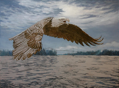
In the final stage of this painting, I add more detail to the wing feathers by modelling individual feathers with a range of tone and colour. I highlight the upper edges of the feathers to create a slight shine and to further accentuate the complex plumage. More detail is also added to the eagle's head and tail feathers. The breaking light in the sky and the reflection on the water is worked up a bit more and the painting is pretty well complete. Once the signature goes on, "Between Nations" is done!

Saturday, October 31, 2009

Painting Progression-Between Nations-Step 9

Now I add depth and detail to the eagle. The eye and heavy beak are primarily rendered with cadmium yellow, burnt sienna and white, with burnt umber and ultramarine blue mixed to create a black in the dark areas. Subtle detail is painted into the underside of the wing and the pinion feathers of the outstretched wing are highlighted to reflect the breaking sunlight.

The near wing is painted with various shades of burnt sienna, ultramarine blue, and burnt umber. The lighter details are mixed with the same colours, with the addition of white as well. When working with alkyd, the drying time is overnight at most, so it is easy to work these detailed areas, allow them to dry, then glaze a thin layer of colour over the entire area to unify and create depth before painting more detail on top. With traditional oils, this type of glazing can take weeks to complete.

The same process is used on the surface of the water, adding more detail and glazing over the entire area before adding more detail on top. It is a wonderful way to quickly build a feeling of animation and depth with subtle colour changes throughout. I use a wide, soft sable brush when glazing and a minimal amount of pigment mixed with a liberal amount of medium.

Friday, October 30, 2009

Painting Progression-Between Nations-Step 8

With the sky and distant background more or less complete, I concentrate on developing the eagle and the surface of the water. It is important to establish a feeling of flight in painting the eagle, particularly in the sweep of the wings. Once again, I use alkyd paint, thinned with Liquin to glaze over the upper wing surfaces, allowing the feather structure to show through. I have also started to model the light and shadow areas of the head and tail feathers. Next, I begin adding highlights to the reflective surfaces of the water, first with a series of darker strokes, then a series of mid-tone strokes and finally some extremely light strokes along the shore lines near the horizon and immediately below the light area of the sky where the sun is breaking through the clouds. This light colour is not pure white, however, it is a subtle mixture of ultramarine blue, burnt umber and white. The very whitest strokes will be saved for final highlights on the painting.

Sunday, October 25, 2009

Painting Progression-Between Nations-Step 7

I have added a bit of white highlight to the edge of the cloud where the sun is trying to break through. This area was strategically placed just above the eagle's head, to help draw the eye to the eagle itself. The water now receives a glaze of ultramarine blue with a touch of burnt umber, mixed with a large quantity of liquin paint medium to make it extremely transparent. The glaze helps to unify the water's surface, although it reduces the feeling of animation somewhat. This will be rectified with carefully placed highlights later on. A dark mixture of burnt umber with a touch of ultramarine blue is used to paint in the shadowed underside of the outstretched wing and breast of the eagle. I also begin to paint in the darkest details and contours of the foreground wing with the same colour mixture.

Wednesday, September 30, 2009

Painting Progression-Between Nations-Step 6

Now I build up the intensity and detail in the trees and bridge structure.  The colours are mixed with a combination of permanent green, ultramarine blue, burnt umber and white.  Next, I begin painting over the acrylic underpainting of the water.  Initially, I had simply suggested the movement of the surface waves.  Now I begin to model the ever changing surface of the water, using three tones of blue-gray.  This gives me a dark, a mid-tone and a light colour to work with.  The mid-tone represents the general surface, reflecting the sky.  The darks suggest the deepest troughs between the waves and the lights suggest the most prominent peaks of waves, which catch the maximum light.  Taken all together they suggest liquid movement.  I add some permanent green to my darkest tone to create the reflections of the trees in the water.  

Thursday, September 17, 2009

Painting Progression-Between Nations-Step 5

Now I begin my finished painting, working in alkyd paint.  I usually begin this work by painting in the sky, which is the furthest away from the viewer.  I intensify and blend the deepest shades of ultramarine & cerulean blue, mixed with white and a bit of burnt umber, at the highest point in the sky, lightening the mixture and removing the burnt umber as I move down toward the horizon.  Burnt umber has a greying effect on the blue mixture which dulls the blue of the sky. 

 As I get nearer to the horizon, I want a cleaner, brighter colour, so now I reduce the ultramarine blue, keep the cerulean blue and add more white into the mixture.  The sky should normally be darkest at the zenith and lightest at the horizon, creating a "dome" effect.

While the paint is wet and workable, I paint the clouds in, blending them softly into the sky.  The lightest and brightest colour is reserved for the area about the eagle's head, where the sun is attempting to break through the overcast.  The clouds appear to be mostly white, but there is a tint of ultramarine blue and burnt umber throughout these soft masses.  Save any pure white for final highlights where needed when the painting is almost complete.  

Friday, September 4, 2009

Painting Progression-Between Nations-Step 4

Now I begin blocking in areas of the painting with simple colours, using acrylic paint mixed to a  rather thin consistency.  The sky is primarily cerulean blue, darkened somewhat  with ultramarine blue at the top of the canvas and lightened with white nearer the horizon.  The land mass in the background is a mixture of sap green, ultramarine blue and white.  The darks that I have painted into the plumage of the eagle is burnt umber.  The ripples on the water are a mixture of burnt umber and ultramarine blue.  A bit of white is used to highlight the area lit by the sun breaking through the clouds in the background.  Not much paint has been applied yet, but already the mood and general look of the painting has been established.  A painting begins to emerge! 

Sunday, August 30, 2009

Painting Progression-Between Nations-Step 3

In this stage I trace down my drawing onto the canvas.  As you can see, the earth tones of the first priming show through the second layer of cooler gray priming.  When I paint in the studio, I usually work out a drawing first, then transfer it to the canvas.  If I am painting on location, especially out-of-doors, I often paint directly onto the canvas with no preliminary sketches.  The two methods usually produce completely different results, since pre-planned drawing will usually be tighter and more controlled.  Direct painting, on the other hand, will give you a looser, freer picture.  In this planned painting, I am drawing from photos that I have taken on the St. Lawrence River and the Thousand Island Bridge between Canada and the USA.  Once the transfer to canvas is completed, a little spray of fixative keeps the graphite from smearing when I  begin to overpaint the drawing.
Related Posts Plugin for WordPress, Blogger...