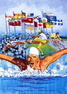
 In honour of the 2010 Winter Olympic Games wrapping up today in Vancouver, I thought I would post an illustration that I was commissioned to paint for the Canada Games when they were held many years ago in Winnipeg, Manitoba. This illustration was painted on a fine weave cotton canvas with acrylic paints. It is hard to beat the intensity of colour that you can get with acrylics. Once again, this is a montage but this time there is a full background included. I enjoyed getting a feeling of animation in the water in the foreground and the flapping flags in the background. The colour scheme is vibrant because of the rich warm skin tones of the swimmer contrasting with the icy blue of the water around her.
Sunday, February 28, 2010
Sports Illustration
 In honour of the 2010 Winter Olympic Games wrapping up today in Vancouver, I thought I would post an illustration that I was commissioned to paint for the Canada Games when they were held many years ago in Winnipeg, Manitoba. This illustration was painted on a fine weave cotton canvas with acrylic paints. It is hard to beat the intensity of colour that you can get with acrylics. Once again, this is a montage but this time there is a full background included. I enjoyed getting a feeling of animation in the water in the foreground and the flapping flags in the background. The colour scheme is vibrant because of the rich warm skin tones of the swimmer contrasting with the icy blue of the water around her.
Saturday, February 27, 2010
Auto Racing Montage
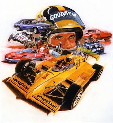
 As I have mentioned before, throughout the 1970's, 80's and into the 1990's, I worked full-time in Advertising Illustration. Many of my clients were in the automotive field, such as Goodyear Tire. I produced a number of illustrations for Goodyear during that time period and this is one example of the work I did for them. What could be more fun to paint than a montage of racing machines diverging at dramatic angles?
I tried to create an interesting and exciting composition that sweeps from back to front in a dynamic and dramatic curve. The rakish angle of the Goodyear Racer in the foreground seems to suggest thrust and speed. A montage must be carefully designed to work as an interesting unit without confusing the viewer. Often it is done as a vignette, so positive and negative shapes must be considered as well. The colour scheme must work as a unit and the design should carry the viewer's eye into the picture and keep it there. A variety of shapes and sizes of the elements within a montage are required to create visual interest. The whole thing can be a lot more difficult than you might think, at first glance.
I painted this illustration on a very fine woven primed canvas, using acrylic paint. Before I began to paint much detail over the finished drawing, I loosely painted a thin wash of colour over the general area of each individual scene, using the local colour of each one. After I painted the various elements in detail, I back-painted around the illustration with white gesso to softly define the shapes.
Subscribe to:
Comments (Atom)
