Thursday, December 31, 2009

Look Into My Big Brown Eyes

Christmas is over, so I want to move on beyond Santa to close out the year. Today is New Year's Eve, the last day of 2009. The winter is just begun, even though it always seems to be well established by this time each year!

This is an illustration that I did a few years ago as a piece of licensed art. For those who don't know, licensed art is designed to appeal to companies who need images to enhance or complete a product which they wish to bring to the market place. They pay a fee, or royalties or both, in exchange for the right to use the image in a prescribed manner on specific products and for a set period of time, usually three years. I do a fair amount of this type of work and I sometimes also license my more traditional paintings as well.

I call this piece "Look Into My Big Brown Eyes". It is a whimsical rendering of a polar bear character, especially appealing because of the "Elton John" sized glasses that he is sporting. This type of light-hearted image can be attractive to companies that produce such products as greeting cards or stitched products.

The illustration was done on illustration board using acrylic paint with a few touches of pencil crayons. The size of the original is 7 inches by 10.25 inches. You can find a complete selection of my licensed art images at www.porterfieldsfineart.com/RichardDeWolfe/richarddewolfemainpage.htm.

Thursday, December 24, 2009

Jolly Old Saint Nick

It's Christmas Eve and I just realized I haven't posted anything for Christmas! I decided to go with this one, an illustration I did some years ago, of the Jolly Old Elf himself. At one time, I worked full time as a freelance illustrator, creating realistic images like this for advertising, editorial, posters, etc.

It is painted on hot press illustration board using acrylic paint, applied with relatively fine sable brushes. The speckles of 'snow' on the wreath were created using a stiff tooth brush to splatter the paint with a flick of my thumb. The ribbon and some of the finishing highlights are done with airbrush, something I used often in illustration during the 1970's and 1980's. The lettering is hand done in acrylic, predating computer fonts.

Thursday, December 17, 2009

500 Years of Female Portraits

This clever video by Philip Scott Johnson is titled ‘500 Years of Female Portraits in Western Art’. The music which accompanies the captivating faces as they continuously change and evolve from one to the next, is Bach’s Sarabande from Suite for Solo Cello No. 1 in G Major, BWV 1007 performed beautifully by Yo-Yo Ma. The video was nominated as Most Creative Video, 2nd Annual You Tube Awards.

Wednesday, December 16, 2009

Posemaniacs

If you are an artist who paints figurative pictures, you know how difficult it can be to work out poses at various angles. There are a number of aides that have been available and these have proven useful over the years. The old tried and true wooden mannequin has served artists for centuries and in more recent times, photography has been used to freeze an action or difficult to maintain pose, which a model just could not hold for any length of time.

One of the latest tools to assist artists in rendering life-like figures, is available on the internet, at www.posemaniacs.com. The site contains every conceivable pose from every possible angle, both in male and female forms. I find one feature of this site to be truly amazing. When you select a pose, you can then drag it with your cursor, and rotate it a full 360 degrees on the horizontal axis! There is no charge for the use of this material, but donations are accepted to finance the production of additional material.

Check out the site at www.posemaniacs.com, and prepare to be amazed by the quality and wealth of information available to artists interested in the human form.

Friday, December 11, 2009

Pleine Aire Painting - The Farm Next Door

Here is the finished painting of the farm next door. It measures 12 inches by 16 inches, which is a great size to work on when using a portable easel or paint box in an outdoor setting. Small enough to manage easily, yet large enough to paint freely in a fairly short period of time.

Monday, November 23, 2009

Pleine Aire Painting - The Farm Next Door


A lot of my paintings are created in the studio, from sketches, quick studies or photos. That allows me to spend as much time as I wish, working out composition, colour scheme, drawing and detail. I can pick up and also pause as the mood or situation dictates. The studio is warm in winter and cool in summer and there is never wind or rain or biting insects to dampen my enthusiasm.

That is all very positive, but in the end, it is difficult to beat the spontaneous simplicity of a painting created on the spot, in 'pleine aire', as they say.


In this case, I set up my french easle by the line fence between our farm and the farm next door. I painted for about an hour and a half, two days in a row. The scene is a small, old barn, which houses one horse and a bit of machinery. The field between was dotted with large round bales of hay which were waiting to be collected up for winter feed.

As you can see in the photos, the sun would eventually come around to a bad angle and I would finish for the day.

This is the scene that I was painting, although by the time I thought to take this photo, the large round hay bales had been removed from the field by the farmer.


The sky is not so interesting, either, having no cumulus clouds to create a dramatic background. The lack of hay bales in the field also diminishes the effect of the foreground. In the photo, the beginning autumn colours in the foliage are much less descernible than they were in reality.

When you paint out-of-doors you must work quickly and simply, in order to capture the scene before the light, mood or weather change too drastically. You must get the most important things done as quickly as you can. This forces you to be decisive and to take some chances with your approach. It is hard work but it is also very rewarding. Your confidence increases and with luck, your sense of accomplishment is much greater than it sometimes is on completion of a studio painting.

I framed this little painting and put it in a solo art exhibition several months after I painted it. It sold right away and alas, I had three separate patrons wanting it for their own.

Monday, November 16, 2009

Painting Progression-Between Nations-Step 10

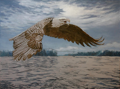
In the final stage of this painting, I add more detail to the wing feathers by modelling individual feathers with a range of tone and colour. I highlight the upper edges of the feathers to create a slight shine and to further accentuate the complex plumage. More detail is also added to the eagle's head and tail feathers. The breaking light in the sky and the reflection on the water is worked up a bit more and the painting is pretty well complete. Once the signature goes on, "Between Nations" is done!

Saturday, October 31, 2009

Painting Progression-Between Nations-Step 9

Now I add depth and detail to the eagle. The eye and heavy beak are primarily rendered with cadmium yellow, burnt sienna and white, with burnt umber and ultramarine blue mixed to create a black in the dark areas. Subtle detail is painted into the underside of the wing and the pinion feathers of the outstretched wing are highlighted to reflect the breaking sunlight.

The near wing is painted with various shades of burnt sienna, ultramarine blue, and burnt umber. The lighter details are mixed with the same colours, with the addition of white as well. When working with alkyd, the drying time is overnight at most, so it is easy to work these detailed areas, allow them to dry, then glaze a thin layer of colour over the entire area to unify and create depth before painting more detail on top. With traditional oils, this type of glazing can take weeks to complete.

The same process is used on the surface of the water, adding more detail and glazing over the entire area before adding more detail on top. It is a wonderful way to quickly build a feeling of animation and depth with subtle colour changes throughout. I use a wide, soft sable brush when glazing and a minimal amount of pigment mixed with a liberal amount of medium.

Friday, October 30, 2009

Painting Progression-Between Nations-Step 8

With the sky and distant background more or less complete, I concentrate on developing the eagle and the surface of the water. It is important to establish a feeling of flight in painting the eagle, particularly in the sweep of the wings. Once again, I use alkyd paint, thinned with Liquin to glaze over the upper wing surfaces, allowing the feather structure to show through. I have also started to model the light and shadow areas of the head and tail feathers. Next, I begin adding highlights to the reflective surfaces of the water, first with a series of darker strokes, then a series of mid-tone strokes and finally some extremely light strokes along the shore lines near the horizon and immediately below the light area of the sky where the sun is breaking through the clouds. This light colour is not pure white, however, it is a subtle mixture of ultramarine blue, burnt umber and white. The very whitest strokes will be saved for final highlights on the painting.

Sunday, October 25, 2009

Painting Progression-Between Nations-Step 7

I have added a bit of white highlight to the edge of the cloud where the sun is trying to break through. This area was strategically placed just above the eagle's head, to help draw the eye to the eagle itself. The water now receives a glaze of ultramarine blue with a touch of burnt umber, mixed with a large quantity of liquin paint medium to make it extremely transparent. The glaze helps to unify the water's surface, although it reduces the feeling of animation somewhat. This will be rectified with carefully placed highlights later on. A dark mixture of burnt umber with a touch of ultramarine blue is used to paint in the shadowed underside of the outstretched wing and breast of the eagle. I also begin to paint in the darkest details and contours of the foreground wing with the same colour mixture.

Wednesday, September 30, 2009

Painting Progression-Between Nations-Step 6

Now I build up the intensity and detail in the trees and bridge structure.  The colours are mixed with a combination of permanent green, ultramarine blue, burnt umber and white.  Next, I begin painting over the acrylic underpainting of the water.  Initially, I had simply suggested the movement of the surface waves.  Now I begin to model the ever changing surface of the water, using three tones of blue-gray.  This gives me a dark, a mid-tone and a light colour to work with.  The mid-tone represents the general surface, reflecting the sky.  The darks suggest the deepest troughs between the waves and the lights suggest the most prominent peaks of waves, which catch the maximum light.  Taken all together they suggest liquid movement.  I add some permanent green to my darkest tone to create the reflections of the trees in the water.  

Thursday, September 17, 2009

Painting Progression-Between Nations-Step 5

Now I begin my finished painting, working in alkyd paint.  I usually begin this work by painting in the sky, which is the furthest away from the viewer.  I intensify and blend the deepest shades of ultramarine & cerulean blue, mixed with white and a bit of burnt umber, at the highest point in the sky, lightening the mixture and removing the burnt umber as I move down toward the horizon.  Burnt umber has a greying effect on the blue mixture which dulls the blue of the sky. 

 As I get nearer to the horizon, I want a cleaner, brighter colour, so now I reduce the ultramarine blue, keep the cerulean blue and add more white into the mixture.  The sky should normally be darkest at the zenith and lightest at the horizon, creating a "dome" effect.

While the paint is wet and workable, I paint the clouds in, blending them softly into the sky.  The lightest and brightest colour is reserved for the area about the eagle's head, where the sun is attempting to break through the overcast.  The clouds appear to be mostly white, but there is a tint of ultramarine blue and burnt umber throughout these soft masses.  Save any pure white for final highlights where needed when the painting is almost complete.  

Friday, September 4, 2009

Painting Progression-Between Nations-Step 4

Now I begin blocking in areas of the painting with simple colours, using acrylic paint mixed to a  rather thin consistency.  The sky is primarily cerulean blue, darkened somewhat  with ultramarine blue at the top of the canvas and lightened with white nearer the horizon.  The land mass in the background is a mixture of sap green, ultramarine blue and white.  The darks that I have painted into the plumage of the eagle is burnt umber.  The ripples on the water are a mixture of burnt umber and ultramarine blue.  A bit of white is used to highlight the area lit by the sun breaking through the clouds in the background.  Not much paint has been applied yet, but already the mood and general look of the painting has been established.  A painting begins to emerge! 

Sunday, August 30, 2009

Painting Progression-Between Nations-Step 3

In this stage I trace down my drawing onto the canvas.  As you can see, the earth tones of the first priming show through the second layer of cooler gray priming.  When I paint in the studio, I usually work out a drawing first, then transfer it to the canvas.  If I am painting on location, especially out-of-doors, I often paint directly onto the canvas with no preliminary sketches.  The two methods usually produce completely different results, since pre-planned drawing will usually be tighter and more controlled.  Direct painting, on the other hand, will give you a looser, freer picture.  In this planned painting, I am drawing from photos that I have taken on the St. Lawrence River and the Thousand Island Bridge between Canada and the USA.  Once the transfer to canvas is completed, a little spray of fixative keeps the graphite from smearing when I  begin to overpaint the drawing.

Friday, August 28, 2009

Painting Progression-Between Nations-Step 2

After the toned canvas has dried, I decided that I would prefer a cooler ground for this picture, so I mix a new batch of gesso tinted with a mixture of ultramarine blue and burnt umber, producing a gray tone.  I repaint the canvas with this color, completely covering the original earth tones.   The new gray surface is still warmed somewhat by the first colour mixture that I applied underneath and I feel this is a more suitable ground for the picture I am about to paint.  Now I am ready to begin drawing and painting on the primed canvas.

Wednesday, August 26, 2009

Painting Progression-Between Nations-Step 1

This painting will be another departure from what I have demonstrated previously.  The painting was a recent commission that I was pleased to receive, since it fell right into the type of picture that I had already been planning to paint next.  Many of my paintings feature the Thousand Islands in the St. Lawrence River, between Ontario, Canada and upper New York State in the USA.  When I was a boy, Bald Eagles nested and fished near my home on the St. Lawrence River.  When the pesticide, DDT became heavily used in the 1950's and 60's, this population of eagles was wiped out, along with many other species in that locale.  In recent years, the Bald Eagle has made a come back to the river and the population is slowly increasing.  Once again eagles can be seen soaring over and fishing the wide waters of the Thousand Islands.

At this point, there is little to see, but I have begun priming my canvas with acrylic paint.  I use a flat, bristle brush to apply a tone to the canvas.  The colour I choose will affect the finished piece, acting as a ground for the colours that follow.  I often use a warm earth tone mixture of burnt sienna and red.  The other colour that I most often use is a blue-gray for a cooler ground.  Here I have started with the warm, earth coloured mixture, which I have combined with gesso to fill the weave of the canvas.  I cover the entire surface evenly and allow it to dry.

Thursday, August 13, 2009

Painting Progression-Seasons Greetings-Step 6

The sky in the background is finished off and the afternoon setting sun is highlighted a bit more.  It is positioned near the snowman's carrot nose and sparkling eyes, helping to attract the viewer's eye to the center of interest of the painting.  The snow-laden tree branch, which also points at Frosty's face, also thrusts into the picture, drawing the viewer's eye back in.  The Cardinal is finished in with more color and detail.  The bird is positioned to keep the viewer's eye going back and forth between these two characters.  The Christmas tree and ornaments are painted in and white highlights are added to create a reflective shine.  I add darks and highlights to Frosty's mittens and make small adjustments throughout the painting, where needed.  A light scattering of new snow falling adds greatly to the feeling of depth and a sense of animation.  The signature goes on and the painting is complete!

Sunday, August 9, 2009

Painting Progression-Seasons Greetings-Step 5

With all of the basic color decisions made, I can now work up detail in every area of the picture.  It is a simple matter to decide where adjustments need to be made once the picture has a complete color map.  The snowman's face is the main focal point, so I try to accentuate his kind, lovable expression. I add soft blue to his coal black eyes to create a luminous shine. Next, I add a sparkle to them with a white highlight.  A strong, bright red on the scarf and ear muffs give him a dashing, festive look.  I use warm yellow highlights on the mittens and a healthy bright orange on his carrot nose.

In order to liven up the snowman's body, I add strong blue-purple in the shadow areas, and I build a texture over the highlighted surfaces with a dry brush effect of heavy pigment.  Frosty is rapidly coming to life as the paint steadily goes on! 

Tuesday, August 4, 2009

Painting Progression-Seasons Greetings-Step 4

Now I begin to paint over the initial blocked-in areas of color.  The sky is refined and painted more heavily, blending the tones together.  The background trees are worked up a bit more, adding some detail and texture.  The old fedora on Frosty's head is painted in and the sprig of holly is added, too.  His features, carrot nose and colorful scarf get more hue, texture and detail added to them, and the picture begins to take on more life and a feeling of depth.  More color and contours are added to the woollen mittens and an initial layer is added to the tree decorations.  Each step taken is another building block in the structure of the painting.  The work is evolving as a whole, rather than one part at a time.  In this way, I always know how all the elements in the picture relate to one another.  My goal is to avoid painting myself into a "corner" along the way.

Friday, July 31, 2009

Painting Progression-Seasons Greetings-Step 3

Now I paint in all of the basic areas using simple colors.  I am working with acrylic paint thinned with water.  For the background sky, I create a  wash of soft blue which I bleed into the yellow of the late afternoon winter sun.  Care must be taken to avoid creating a sickly green where the yellow and blue tones meet.  Each area I add helps to create a map of what the finished piece should look like.  With the basic colors laid in, it is easy to decide what adjustments to make and to which areas in order to create the look that I want.  If I painted one area completely before working on another, I would probably need to change it later, in relation to other areas in the picture.  It is best to work over the entire picture, building a solid foundation first.

Sunday, July 26, 2009

Painting Progression-Seasons Greetings-Step 2

When I begin to paint, I prefer not to work directly on a white surface.   I use a toned surface to help me see the colors I am applying more accurately.  The surface color that I choose will also influence the finished result by unifying the final colors that will be applied later.  I usually also allow some spots where this  base color shows through in the finished piece.  Here I have chosen violet purple which will be the basic shadow color in the painting, especially on the main subject, our illustrious snowman.  Violet purple is a warm color, which will make a nice compliment to a winter scene.

I mix my pigment into a generous amount of mat medium.  This makes the mixture very transparent, allowing my pencil drawing to show through clearly.  The white of the art board also shows through, keeping the ground color from being too dark or heavy.  By using a mat medium rather than gloss, I avoid creating a shiny surface to work on.  The acrylic paint dries very quickly and I am ready to start painting!

Thursday, July 23, 2009

Painting Progression-Seasons Greetings-Step 1

Here is something completely different for a change of pace.  No horses in this one!  At one time, most of my work was illustrations done for advertising, books, magazines, posters and point of purchase displays, etc.  These days I do some of my art for licensing.  Companies pay me to use my art on commercial products such as greeting cards and puzzles.  This is a piece of art which I have created specifically for this type of application.  It is painted on art board and the image size is 9 inches by 12 inches.  I have painted the finished picture it in acrylic, which is a fast medium to use on a project such as this.

The first step is to produce a series of rough sketches to perfect the idea, building a workable composition that will attract attention and be pleasing to the viewer.  A jolly snowman must convey a warm and friendly personality, and the cardinal needs to be carefully placed in a natural pose.

When I am satisfied with the results, I  trace my finished drawing onto illustration board, clean it up, and spray it with workable fixative.  It is now ready to begin painting!

Saturday, June 27, 2009

Painting Progression-Sleigh Bells-Step 9

The final session is the most satisfying.  Everything comes together to create an inviting winter scene.  I add darks where necessary and model the snow with light and dark tones to create contour and light and shadow.  The edge of a palette knife is used to simply suggest wire on the fence posts.  White highlights are one of the last things I do and these help to guide the viewer's eye to specific areas in the painting.  I embellish the coats of the horses and add final details to the harness.  The last thing to do is add a signature!  Fini.

Monday, June 22, 2009

Painting Progression-Sleigh Bells-Step 8

Once all of the basic elements and areas have been initially painted in with alkyd paint, I begin the process of finishing each area, maintaining a harmonious relationship with the overall picture.  I begin from the sky (the most distant background) and work my way forward, adding detail, contrast and harmony.  I have embellished the light in the sky somewhat, softened the hills in the distance, and added detail to the buildings in the middle ground.  The trees on the left are painted in, providing a nice border and visual stop on that side of the picture.  I spend quite a bit of time on the trees and underbrush on the right side of the picture, deepening the green of the foliage, creating subtle shades on the snow of the branches and detail in the tangle below.  More detail is added to the snow and the roadway,  the fence posts are added and finally I spend much time painting the horses and harness and the sleigh bells from which the painting gets its name.

Friday, June 19, 2009

Painting Progression-Sleigh Bells-Step 7

I have blocked in the rest of the foreground snow and shadows, creating a rutted look in the surface of the roadway and contours in the mounded snow at the shoulders of the road.  The contour lines of the road help to draw the eye into the picture and the horses appear to be in motion as they draw the unseen sleigh forward. 

Friday, June 5, 2009

Painting Progression-Sleigh Bells-Step 6

The mood of the painting starts to change rapidly as I begin to paint in the middle ground.  The muted tones of the snow on the large pine trees on the right side of the picture create a nice contrast to the brighter white of the snow on the ground leading into the foreground.  These tree branches keep the viewer's eye from leaving the picture and frame the focal point of the colorful red barns that the horses are approaching.

Thursday, May 28, 2009

Painting Progression-Sleigh Bells-Step 5

Now I switch to alkyd paint, bringing subtle color and cloud forms into the winter sky.  I usually paint from light to dark and from distance to foreground, as I am in this instance.  Next I paint the most distant hills with soft tones tinted with blue to accentuate a feeling of distance.  As I move forward I add more local color and detail to the hills creating a depth to the picture.  The nearest hills have a strong suggestion of trees and snowy spaces between them.  The background now has a sense of reality that I like.

Saturday, May 23, 2009

Painting Progression-Sleigh Bells-Step 4

I am still working with acrylic paint, but now I begin blocking in local color in the sky, hills, buildings, trees and horses and their harness.  This gives me a basic color map of how the painting will look and how the colors will relate to each other as I continue to build my painting.  It is wise to establish an under painting, that is blocked in quickly.  Adjustments and improvements and even complete re-do's are easily done at this point.  If you spend a great deal of time finishing off an area, then find it isn't working properly in relation to the rest of the painting, it can be very hard to bring yourself to change it, thus compromising the finished piece. 

Wednesday, May 13, 2009

Painting Progression-Sleigh Bells-Step 3

I am still working in acrylic paint at this stage in order to get my underpainting established quickly and simply, without the need for any drying time between sessions.  I use my mixture of burnt sienna and cadmium red to wash in tones in the distant hills, the buildings, trees and snow.  As I move further into the foreground, I use heavier, darker mixtures of the same colors. Next I add more detail in the trees and the harness on the horses using burnt sienna and burnt umber.  This simple, monochromatic approach is already establishing the lights and shadows in the painting as well as creating a good illusion of depth at the same time.  This will give me a good basis to build my painting on.

Monday, May 4, 2009

Painting Progression-Sleigh Bells-Step 2

As I usually do, I now tone the canvas with a warm tone of burnt sienna and cadmium red, mixed with a large quantity of mat medium.  This allows the mixture to remain quite transparent, there by preserving my sketch beneath.  At this point I am using acrylic paint, because it dries very quickly.  After I complete my initial underpainting, I will switch to alkyd paint, a type of oil medium which I do my finished paintings with most often.  It is fine to paint over acrylic paint with oil based paints, but never the other way around.

Saturday, May 2, 2009

Painting Progression-Sleigh Bells-Step 1


Add ImageIt's time to post another painting showing the progressive steps I took to complete it.  Once again, this painting features horses, this time a team of Belgians in harness.  The title of the painting is "Sleigh Bells", which adorn the showy harness on the backs of the horses.  Not all of my paintings are of horses, but so far all of my posts have had them in them.  Maybe the next one will be different!

I started this painting on a 16 X 24 inch stretched canvas, sketching the main elements with a number 2 pencil.  A softer pencil is very black and smudgy on the gesso priming of the canvas. When the sketch is complete, I give it a light spray of workable fixative to hold the pencil when I tone the canvas with acrylic medium in the next post.

Tuesday, April 7, 2009

Painting Progression-Moonlight Travelers-Step 7

I paint in the near horse, keeping it whiter and more detailed than the off side horse, again to create a feeling of depth and to control the viewer's eye.  Lighter objects, with more detail and contrast attract more attention in a picture.  The sleigh and occupants are painted in, along with any final details and accents here and there.  The last thing is my signature, and the painting is complete! 

 If you are interested in originals or prints of my work, please visit my website and see what is available.  I am also always happy to discuss commissions if you have a special project in mind.

Tuesday, March 31, 2009

Painting Progression-Moonlight Travelers-Step 6

Now the painting is really starting to come together.  I paint detail into the trees, starting with the most distant ones first, keeping them light and more blue in the distance.  The snow on the branches is light blue, rather than white.  The trees in the middle ground have more local color and more definition to bring them further forward.  The snow on those branches is lighter in color, too.  In the foreground, I have painted the snow in dramatic shades of blue and lavender with subtle highlights of creamy yellow.  I have done this to create an atmosphere of light reflecting from the building along with ghostly moonlight and shadow.  There is virtually no white used in the snow.  This will make the moon seem much brighter, since it is the lightest object in the picture, other than the horses in the foreground.  I want to keep some attention on them, so they are almost as bright as the moon itself.  I have started to overpaint the far horse, keeping the tones subdued relative to the near horse to create a sense of depth in the painting.  More color and detail has also been added to the building to finish it off as the feature element dominating the picture.

Sunday, March 22, 2009

Painting Progression-Moonlight Travelers-Step 5

I have already given the team of horses much attention, painting over the initial acrylic underpainting with alkyd paints.  The sleigh has started to take shape as well.  I continue to overpaint the Victorian mansion with alkyd paints, giving it a warm glow in contrast to the cool blue moonlight sky.  There is much intricate detail in this grand building and much care must be taken to do it justice.  The snow is embellished with both warm and cool colors to reflect the night sky and the warm building lights.  

Other details begin to fall into place, and the picture is beginning to take on the feeling of depth and atmosphere that I want to achieve.  The horses and sleigh seem to be trotting briskly along the roadway, leaving the building behind as they come forward toward the viewer.  The shadows beneath the horses and sleigh testify to the brightness of the moonlight and anchor these figures to the surface that they are moving over.

Wednesday, March 11, 2009

Painting Progression-Moonlight Travelers-Step 4

Now I switch from acrylic paint to oil or alkyd or a combination of both.  Oil and alkyd paints are completely intermixable and can be used in any ratio if you want to mix them together.  It is quite acceptable to paint oil based paints over top of acrylic but never the other way around, since acrylic paints are water based.  Here I have painted in the night sky and the moon, giving it a bit of a glow.  By adding a few stars in the sky, I have created a nice backdrop for the majestic victorian building, which is the centerpiece of the painting.

Monday, March 2, 2009

Painting Progression-Moonlight Travelers-Step 3

My underpainting is executed in acrylic paint, just blocking in basic colors and defining shapes and areas and how they relate to each other.  It is much faster to work in acrylic rather than oils or alkyd when working out the initial color scheme.  This is a great way to establish a simple map of the painting and to foresee any problems that may arise later on.  I don't worry about exact colors or any real detail, just a general impression of how things should look. 

Sunday, March 1, 2009

Painting Progression-Moonlight Travelers-Step 2

After fixing my pencil drawing on the canvas, I use a transparent mixture of acrylic color and mat medium to tone the surface.   I use a combination of burnt sienna and cadmium red to give the canvas a warm, rich ground to paint on.   Now I no longer have to try to compensate for the bright white of the canvas when I apply paint to my drawing.

Saturday, February 28, 2009

Painting Progression-Moonlight Travelers-Step 1


Once again, I have a painting of horses for this demonstration.  Horses are not my only subject, but it seems as if most of the paintings that I have documented as I work, happen to have horses in them.  This one is a scene rather than a portrait and brings many other elements into play.

This is my initial pencil drawing on canvas.  I have incorporated a large amount of detail into this drawing, especially in the complex areas such as the victorian building, the horses and sleigh and the figures within.  I use a spray fixative to hold the pencil from smudging when I begin to paint.

Thursday, February 19, 2009

Choosing A Brush

I received a question regarding the brushes that I used in the horse portrait demonstration.  This painting is very small, measuring 6 1/2 inches wide by 9 1/2 inches in height.  For this reason, the brushes I used were relatively small as well.  For the background I employed a 1/2 inch flat sable brush.  For the initial block in of color on the subject itself, I used a #3 flat nylon brush (about 5/16 inch in size).  For most  of the detail work, I used a #4 nylon round brush and for the very finest details and fine lines, I selected a #1 round sable brush.

The brushes I use vary according to the job at hand.  The style of brush, i.e. round, flat or filbert, most often depends on the area to be painted, how heavy the paint application is going to be, and the degree of texture desired in the strokes.  The type of bristle I select may depend on the support surface I have chosen, such as canvas, paper or board, the type of paint I am applying, such as oil, acrylic or water color, etc., and the effect I hope to achieve.  The size of the brush I employ is often determined by the size of the painting itself.  The larger the size of the overall painting, the larger the average size of brushes I will use.

It is best to use the largest  brush possible to complete a given area.  Initial blocking in should be done as broadly and as simply as possible, too.  This keeps your work fresh and expressive, without becoming overworked and tight.  As you continue to add detail, you can gradually reduce the size of brush you employ, creating the level of detail you want while maintaining a spontaneous, lively feel.

Large areas, such as skies, atmosphere, backdrops, etc., can usually be blocked in with a large, flat brush.   This can produce quick results and establish a ground for further detailing as you continue to add detail and texture, as well as smaller or more intricate shapes within the area.  In areas that you want to give a softer, smoother texture, a filbert brush, which is a compromise between a flat and a round brush, may be a good choice.  Blending is best accomplished with the largest brush possible in the area to be painted, or by using a fan brush made for this purpose.  Long, thin strokes can be achieved by using a flat brush on it's edge, or with a round, bright brush.  A long bristled liner brush is also made for this type of work.  A round brush, which can maintain a point, may be the best choice in areas that require a finer degree of control.  As you increase detail, you will need to reduce brush size. 

Saturday, February 7, 2009

Painting Progression-Horse Portrait in Acrylic-Step 5


The final stage of this painting should pull everything together.  I apply a final glaze of acrylic color over the dark areas of the horse with a mixture of burnt umber and ultramarine blue.  I do not want to obliterate the warm sheen of umber on the highlight areas of the horse's coat, so I use a generous amount of mat medium in my glaze to keep it semi-transparent.  I finish in the darkest details with black, then adjust a few subtle areas such as the pink of the muzzle and the blaze on the nose before adding the final touches of extreme highlights over all of the reflective areas on the horse and tack.  I add some clean light blue in the background, next to the horse's face to increase the contrast in this area.  This will draw maximum attention to the face of the subject.  The last thing to do is add my signature and the painting is complete.

Wednesday, February 4, 2009

Painting Progression-Horse Portrait in Acrylic-Step 4


At this point I darken the local color of  the subject, adding detail.   I continue to add more intensity and  depth to the dark areas and shadows.  I also paint in the lightest areas and add detail to the bridle and reins.

Monday, January 26, 2009

Painting Progression-Horse Portrait in Acrylic-Step 3


Now I paint in the light areas, basically blocking them in, thus creating a third tonal range.  This is how I systematically establish the darker shadows, the local mid-range colors and finally the light colors and highlights, which tend to be closest to the light source. 

Sunday, January 25, 2009

Painting Progression-Horse Portrait in Acrylic-Step 2


In the first stage of the painting, I blocked in the basic mid-tones.  Now I add darks to begin establishing more depth to the picture.  I am controlling separation of the background from my subject by painting darks in the background nearest to the lighter areas in the foreground, and visa-versa.  

Friday, January 23, 2009

Painting Progression-Horse Portrait in Acrylic-Step 1


This is the first stage of a small painting that I completed recently.  I have blocked in washes of colour in a loose fashion initially.  I have used warm tones on the subject and a cooler blue in the background.
Related Posts Plugin for WordPress, Blogger...